Archives

Maker Stories

Poster Precursors: A Look at Tim Sanders’ Sketchbooks

October 26, 2015

Artist’s sketchbooks, notebooks, drawing pads–whatever term you prefer–have been objects of study, fascination, and even obsession for museum curators, art appreciators, collectors, and the like. Sketchbooks contain the process people often struggle and crave to understand about art: how an artist germinates ideas, eliminates the unattractive ones, and gradually evolves those ideas to their final form. The creative process is allusive and captivating, and I like to think of the sketchbook as treasure map to understanding that process.

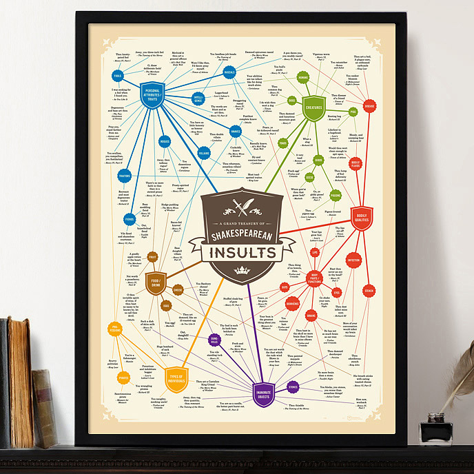
 A Grand Treasury of Shakespearean Insults | UncommonGoods

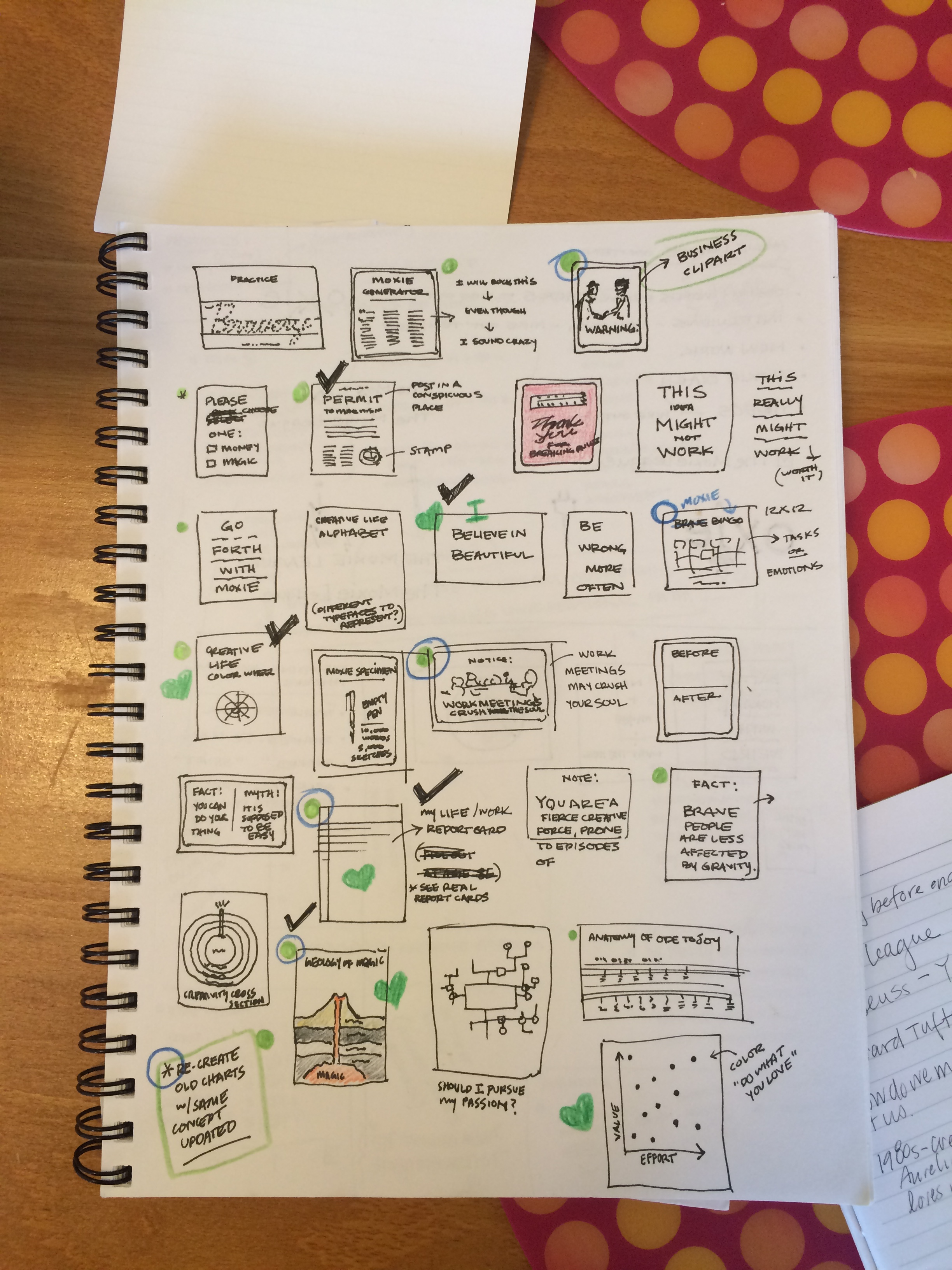
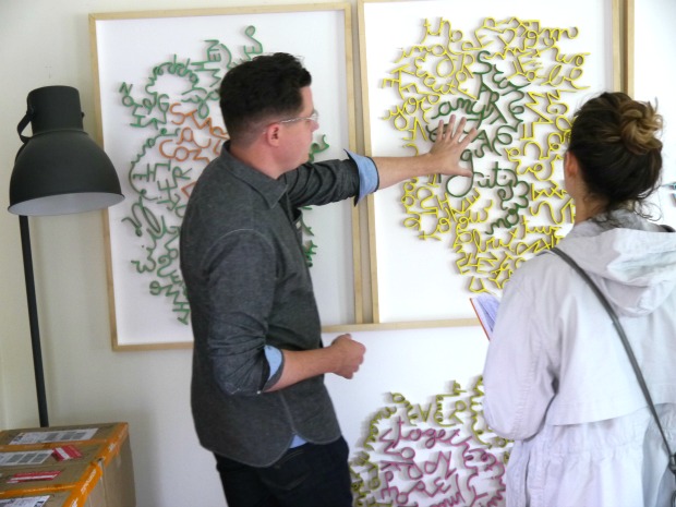
Tim Sanders, who created A Grand Treasury of Shakespearean Insults and 1980s Slang Chart with his wife Aurelia, was kind enough to share some of his sketchbook pages with me on a recent visit to his studio in Seattle, WA. His sketchbooks were large, maybe 11×14, and made of that delightfully thick, creamy artist’s drawing paper. Tim’s sketchbooks were among the most organized I’ve ever laid eyes on. Instead of the John Cage-like scribbles and quickly jotted phrases that seem like a secret code only the creator would understand, many of the pages I peeked contained a grids of small squares. These squares represent poster ideas–hundreds of them.

Tim and Aurelia Sanders | UncommonGoods

One of my favorites appears prominently at the top left corner of the page and reads “Practice Bravery.” Cleverly, Tim has drawn out Bravery in a script of small hash marks, confined by guiding lines. This brings to mind memories of staring at the the poster guides for learning cursive that hung in my fourth-grade classroom, a memory made more poignant by the fact that we rarely use script in this digital age. Some of Tim’s ideas are a bit more sarcastic, especially when speaking to the workplace.

Tim's Sketches of Future Art Posters

Another favorite of mine reads “NOTICE: Work meetings crush the soul.” This warning resonates with most of us who work in an office, and putting it on a poster means that when we see it, we can all nod our collective heads in agreement that meetings can, in fact, crush the soul! As an art director and former playwright, Tim certainly has a knack for using his art to reflect the times and engage his viewers.

Tim Sanders' Sketchbook

To develop and push his ideation, Tim has a system for selecting the most worthy of his poster candidates to continue to the next level of development. Across the pages are clues of a cryptic system of black check marks, green hearts, and green dots, some of which are circled with blue pencil. Instead of asking Tim to hand over the key to his editing notations, I prefer they remain part of the mystical creative process. Tim’s sketches and notations are less like accurate GPS directions, and more like a treasure map illuminating milestones along his creative path from idea to final piece. Undoubtedly, there will be unexpected twists and turns to reach the poster.
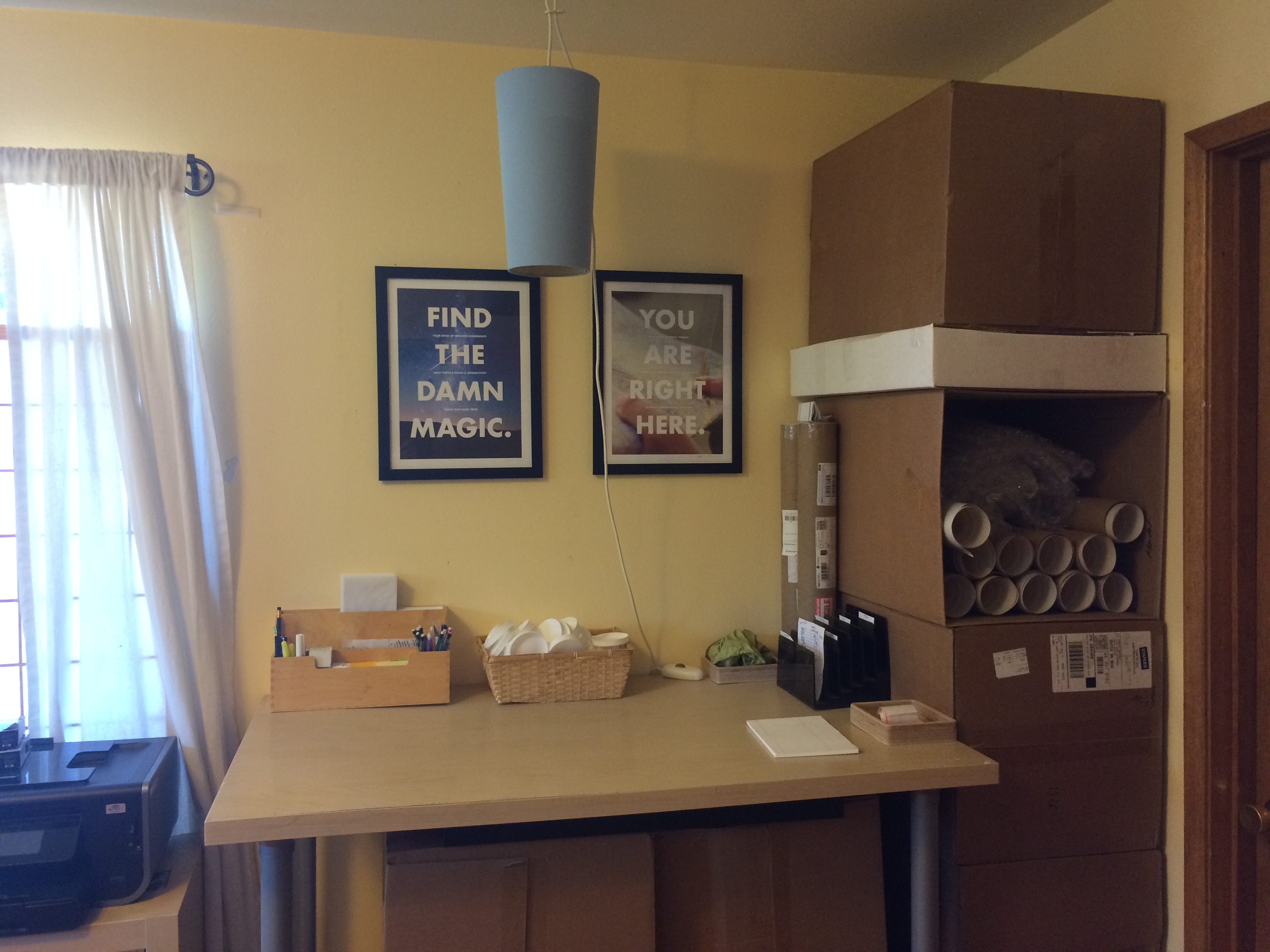
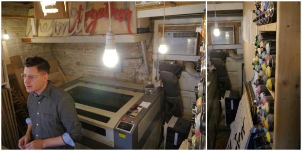
Inside Tim's Studio

See the Collection - Tim and Aurelia Sanders | UncommonGoods

Maker Stories

Matthew Hoffman’s Musings On Inspirational Messages In Art

July 2, 2015

mh_highres_2

I asked Matthew Hoffman which comes to him first, the words or the design.  He replied that the words always come first for him.  At the root of his artworks are ideas, messages, communications, and philosophies, which is why I believe Hoffman to be a wordsmith as much as an artist.  Very few artists these days are able to combine succinct phrasing and a recognizable application such as Matthew Hoffman’s silver “you are beautiful” stickers, which have been applied to street posts, subway cars, and other public places the world over.  Hoffman’s success with this campaign speaks to people’s attraction to the wonderment of discovering subtle, sometimes hidden reminders of empowering, encouraging messaging.  

Inspiringly, Hoffman has never been inclined to use quotations; he prefers to communicate his own genuine, unique sentiments.  Not relying on the words of others allows for word play and humor in his artwork. “you got this” and “up & at ‘em” are by no means grammatically correct, but they are pithy poetry that get right to the point.  It’s no surprise Hoffman has made a career and successful business by making artworks from his philosophies.

So, for an artist who has global reach and recognition, would you believe me if I told you most all of his work—including the pieces he makes for UncommonGoods—he produces from his converted one-car garage?  Hoffman and his crew are pros at organizing and operations. Rainbows of spray paint cans are stacked in shelving along the walls, and sheets of wood neatly lean next to a scroll saw. No piece of wood enters the studio larger than can fit in his lasercutter, about 3 square feet.  

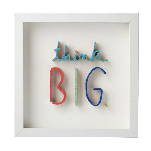
Even for an artist who abides by “short and sweet” phrasing and creating replicable pieces, Hoffman puts lot of care into his craft.  For example, Think BIG. is painted lovingly by hand in six bright, bold colors on the work table that doubles as storage locker.

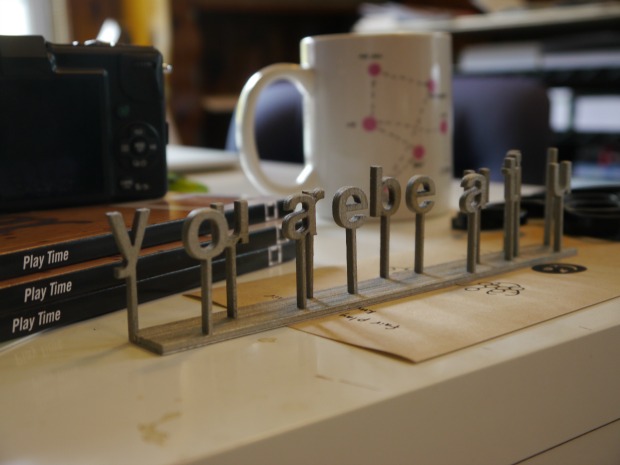
Directly above Hoffman’s studio is his equally organized office space, where all the pieces from his ‘You Are Beautiful’ campaign — including the eponymous cursive wood phrases — are packaged with care.  From this efficient, cozy home studio, Hoffman sends his pieces off to hundreds of people looking to surround themselves with empowering, encouraging words.

Can you elaborate on the You Are Beautiful project? What initially inspired the concept?
I moved from small towns in Ohio and Indiana to Chicago in 2002. The city was overwhelming & exciting. In all that noise, I think it’s easy to feel lost & like you don’t matter. I just wanted to quietly add a little voice here and there, that said “don’t worry about it, it’s all good, everything’s alright, just as you are.” It started with 100 stickers, and has spread organically by the community.

Describe your process. What steps go into making each piece?
I think each piece comes along in 2 directions. First, what it means or is going to say. I am constantly jotting down notes or ideas of future pieces. When I have a moment, I pull them all out, and start working with the most interesting or funny ideas. Second is what the piece is made of, and how. I’m always researching new materials & testing out unlikely combinations. I’m always trying to push the boundaries on each piece, in both directions.

Are you mainly solo, or do you collaborate with a team to produce your pieces? If so, who are the collaborators?
Pretty much across the whole spectrum. I like to spend time working alone, brainstorming, playing, testing, basically tinkering. Then I pass my findings by a few trusted people and get input. I generally make the first prototype and then figure out all the kinks. As a team, we make the edition of an item, from start to finish. I always enjoy the conversation along the entire process of a piece  always pumped to start the next one.

In your This Just In-spiration interview, you mentioned that it wasn’t until a class in high school that really “turned up the heat on making art and design.” What class was this, and how did it inspire your career path? (Or perhaps, how/why did it change your life?)
I had to take an art class to fill my requirements for my high school honors diploma. I had always considered my tinkering a hobby. The class was Visual Communications. It had teal G3 towers, a dark room, airbrush station, and on. I soaked in tons of technical skills, and by the end of the year – I was applying as a design major to college.

In that interview, you also mentioned that “if you’re not having fun (and adding value to the world), what’s the point?” How do you follow this philosophy in your daily work?
It’s easy to forget that lesson, so you have to constantly remind yourself. I’m very fortunate now that we have more going on than we can possibly handle, so that means saying no to a lot of things. So if something new comes up, and it doesn’t get me excited, or we’re not going to have fun doing it, or if the person/company doesn’t seem nice or fair to work with – we’ll pass on it. Life’s too short!

You say that you “try to make public work, that is accessible to everyone – no matter who you are.” Why do you think this is important?
I want to make work that is smart, funny, & engaging, but also that anyone can get behind. I really like the democratic idea of getting art in as many peoples minds or hands as possible. Everyone’s welcome — no one should feel left out.

What’s your favorite thing that someone has said about your art?
It might seem counter productive, but I really like the work I make to be more important than who’s making it. So I love when people tell me that they’ve seen the work for the longest time, really enjoyed it, and had no idea who made it or where it came from. Life’s more fun when it’s a little mysterious.


Maker Stories

Inside the Artist’s Studio with Phil Thompson

January 14, 2015

Phil Thompson | UncommonGoods

Frank Lloyd Wright, Louis Sullivan, Mies van der Rohe, Jeanne Gang—some of the greatest, most renowned names in architecture–have marked their space on the Chicago skyline. Their skyscrapers, public buildings, and homes in the Windy City have shaped modern design over the centuries. It is no wonder, then, why illustrator Phil Thompson finds inspiration in Chicago’s Prairie Style bungalows, classic six-flat brick Craftsman buildings, and skyscraping architectural landmarks. As a recently departed Chicagoan, I can attest that Phil and his wife and studio mate, Katie, live in one of those architecturally remarkable apartments that most of us dream of finding. Built in 1912, the Craftsman flat has many of its original Deco fixtures and warm, comforting wood detailing.
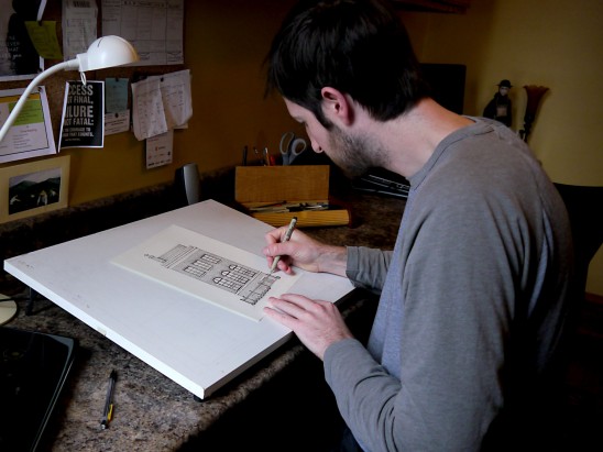
A colleague here at UncommonGoods tipped me off to Phil’s intricate custom home portraits. The cleanliness of his structured, blueprint-like approach suitably matches the sparseness of his studio. He surrounds himself just with what he needs: drawing paper, a basket full of trusty micro-pens, and drafting tools. There are a few exceptions to the sparseness—all of which are largely contained within a small bulletin board—a calendar, the usual lists of to-dos, and some inspirational quotations. Phil also prominently displays a beautiful postcard-size watercolor by his grandmother to remind him of his artistic roots.
I am always thoroughly impressed and warmed by artists that are able to seamlessly and successfully blend their passions and skills. Phil and Katie are two of those artists. He pairs his discerning eye and exacting hand with a passion for accurately rendering architectural styles and the home. Phil’s Classic Home Portraits honor those places where we build memories, families, and community.

Continue Reading…