Browsing Tag

Architecture

Maker Stories

Inside the Artist’s Studio with Molly McGrath

March 27, 2015

Molly McGrath | UncommonGoods

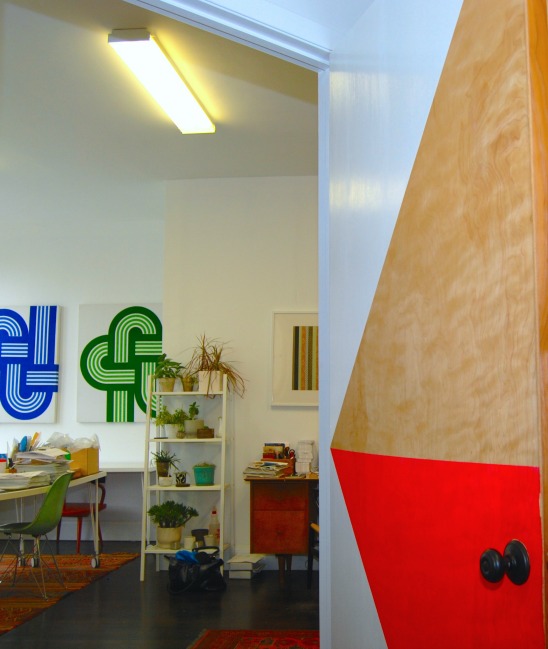
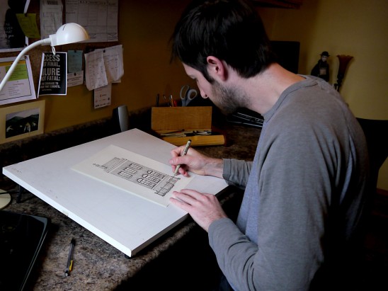
Molly McGrath is a laser-cutting artist who marries her architecture training with her love for geometric shapes and bright hues. Molly’s statement art pieces are known for intricacy and precision, yet words like “lively” and ”fun” still come to mind when you see them. I visited Molly’s lovely studio in the heart of The Mission in San Francisco and it wasn’t a surprise that her open space mimicked her artwork’s aesthetic – flashing lots of playfulness with even more color. Her studio held lots of character, from her personable knick-knacks to her hand painted geometric doors, I simply couldn’t focus on just one thing. Natural light flooded in, her laser cut designs peeked out from drawers and vignettes, and her desktops were scattered with signs of production. I felt like I was standing in the middle of a real life Pinterest board titled “Interior Eye Candy.” It was clear that Molly built a home away from home – a space that was truly hers to the very core.

Molly McGrath | UncommonGoods

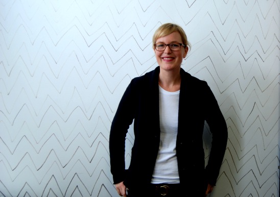
Creatives often try their best to limit distractions in order to stay focused on their craft. Yet it was procrastination for Molly that ignited the initial spark for her small business. As Molly told me, “I used a laser cutter extensively in architecture school – making models mostly out of birch plywood. I have always made jewelry and one day, while procrastinating, I decided to make some earrings on the laser cutter. That was the beginning!” Read about Molly’s friends Larry and Lola, what quote keeps her inspired, and her current obsession to perfect her craft!
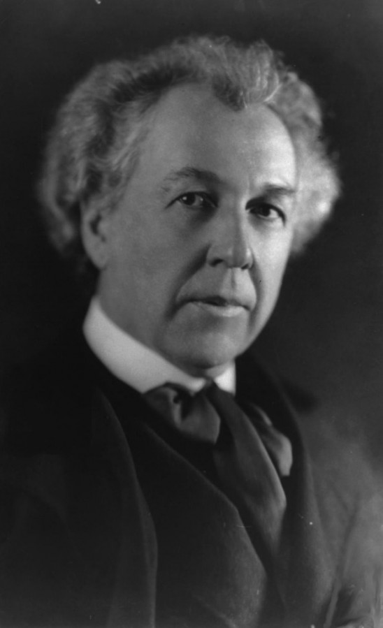
Continue Reading…

Design

Uncommon Design School: Less is More

February 13, 2015

Love it or loathe it, we all know minimalism when we see it. A neutral palette comes to mind. Forms tend to be aggressively geometric. International Style buildings…Scandinavian furniture…deconstructed timepieces like our On the Other Hand Clock. Some find minimalist designs thrilling in their integrity. Others find them stark—even threatening. Whatever your reaction, one handy phrase comes to mind: less is more.

On The Other Hand Clock | UncommonGoods

On the Other Hand Clock

A conceptual cousin to ‘form follows function,’ this cool but cheekily contradictory aphorism is a close contender for the top modernist mantra—a quotable bit of wisdom that may still be echoing through the lecture halls of many a school of architecture and design. But, like Louis Sullivan’s alliterative catch phrase, less is more deserves an investigation of its history.

The phrase is most closely associated with the designer who embraced the association: architect Ludwig Mies van der Rohe. For Mies, it was an apt slogan for his pursuit of design purity. The intentional contradiction helps make it memorable, but essentially it means “the less complicated the design, the better.” The less of less is more is apparent in the work of Mies and other midcentury modern designers, but the more means ‘better,’ with a note of pseudo-spiritual zeal.

Barcelona Pavilion | Wikipedia

The Barcelona Pavilion designed by Ludwig Mies van der Rohe, Wikipedia

Much as Mies’ cigar-puffing visage comes to mind when you hear the phrase, he had to admit that he didn’t coin it. He credits his modernist mentor, Peter Behrens. The young Mies, working in Behrens’ studio, recalls that he showed his boss some design options for a factory façade, to which the elder architect replied “less is more.” This set the tone for Behrens’ elegantly minimal approach to industrial design, and Mies took up the banner for other types of buildings as well.

But wait—there’s more (or is it less?) to this story. The phrase crops up before Behrens was born, in a poetic context: Robert Browning’s poem Andrea Del Sarto (called “The Faultless Painter”) of 1855.

Yet do much less, so much less, Someone says,
 (I know his name, no matter)—so much less!
 Well, less is more, Lucrezia: I am judged.

Browning employs the phrase in an imagined diatribe by a B-list Renaissance painter who works in the shadow of the likes of “Michel Agnolo” (Michelangelo). Hardly the heroic, modern origins you might expect.

Bike Print | UncommonGoodsThe Bicycle Encyclopedic Print

Whether or not Behrens and Mies were aware of Browning’s poem, the phrase got a modern makeover that puts a positive spin on minimalist aspirations. Not to be outdone, maverick architect Frank Lloyd Wright quipped “less is more, only when more is no good.” Apparently, Wright wanted to indicate that he was hip to mid-century trends, yet wanted to keep his options open.

Design

Frank Lloyd Wright For Our Feathered Friends

January 28, 2015

When I saw the sample of our new Prairie Bird Feeder from across the room, I recognized its inspiration instantly: the so-called “Tree of Life” art glass pattern—probably the best-known motif from Frank Lloyd Wright’s Buffalo masterpiece, the Darwin D. Martin House.


Prairie Bird Feeder

But I suppose I should be able to spot such patterns at 50 paces. After all, I spent nine years as curator for the Martin House Restoration Corporation, helping to preserve, document, and share such designs with the public. I stopped short of getting a Tree of Life tattoo, but you might say that the Prairie style is in my blood.

Frank Lloyd Wright designed in concert with Nature—with a capital N, he insisted—and Drew Kelley’s Wright-inspired bird feeder design follows that organic lead. The cedar feeder is simply stained as Wright might have done, and its miniature roof is gently pitched and cantilevered like the rooflines of the Martin House and other homes of Wright’s Prairie period (c. 1900-1914). Add the art glass motif applied to the side panels, and those birds will be eating in sublime style.

Darwin D. Martin House

Darwin D. Martin House, Wikimedia Commons
But there’s another connection between Kelley’s bird feeder and the Wright house that inspired it. With relatively free reign on his ambitious Buffalo commission, Wright designed not only an interconnected complex of five buildings for the Martin family, but also an impressive complement of furniture, fixtures, art glass (nearly 400 pieces), and custom architectural details. He even designed custom clothesline poles for the kitchen garden and four limestone birdhouses to adorn the roof of the Martins’ conservatory.

Wright’s birdhouses feature multiple chambers in a colony-like configuration favored by purple martins. So, scholars suspect that the birdhouses were, in part, a play on the name of the client (martin / Martin). And like purple martins, the human Martins lived communally, with extended Martin family (Darwin D. Martin’s sister Delta Barton and her family in the smaller house in the complex) and servants living in the same complex. Beyond Buffalo, Wright also designed a custom birdhouse for the Westcott house in Springfield, Ohio.

Darwin Martin Bird Houses

Birdhouses, Darwin D. Martin House. Biff Henrich /IMG_INK, courtesy Martin House Restoration Corporation.
After challenging American architecture in the Prairie period, Wright went on to design some of the most iconic buildings of the 20th century, such as Fallingwater and the Guggenheim museum in New York. His body of work—both realized and conceptual—also includes a mile high skyscraper for Chicago, and a house for Marilyn Monroe and Arthur Miller.

Despite this dazzling portfolio, you can safely say that at least a few of Frank Lloyd Wright’s designs were for the birds…and so is our new bird feeder.

Maker Stories

Inside the Artist’s Studio with Phil Thompson

January 14, 2015

Phil Thompson | UncommonGoods

Frank Lloyd Wright, Louis Sullivan, Mies van der Rohe, Jeanne Gang—some of the greatest, most renowned names in architecture–have marked their space on the Chicago skyline. Their skyscrapers, public buildings, and homes in the Windy City have shaped modern design over the centuries. It is no wonder, then, why illustrator Phil Thompson finds inspiration in Chicago’s Prairie Style bungalows, classic six-flat brick Craftsman buildings, and skyscraping architectural landmarks. As a recently departed Chicagoan, I can attest that Phil and his wife and studio mate, Katie, live in one of those architecturally remarkable apartments that most of us dream of finding. Built in 1912, the Craftsman flat has many of its original Deco fixtures and warm, comforting wood detailing.
A colleague here at UncommonGoods tipped me off to Phil’s intricate custom home portraits. The cleanliness of his structured, blueprint-like approach suitably matches the sparseness of his studio. He surrounds himself just with what he needs: drawing paper, a basket full of trusty micro-pens, and drafting tools. There are a few exceptions to the sparseness—all of which are largely contained within a small bulletin board—a calendar, the usual lists of to-dos, and some inspirational quotations. Phil also prominently displays a beautiful postcard-size watercolor by his grandmother to remind him of his artistic roots.
I am always thoroughly impressed and warmed by artists that are able to seamlessly and successfully blend their passions and skills. Phil and Katie are two of those artists. He pairs his discerning eye and exacting hand with a passion for accurately rendering architectural styles and the home. Phil’s Classic Home Portraits honor those places where we build memories, families, and community.

Continue Reading…

Design

Uncommon Design School: Form Follows Function

January 8, 2015

From musical wine glasses to self-filtering popcorn bowls, the distinctive variety of our collection relies on interactions of form and function. Sometimes these interactions are straight out of the design handbook; sometimes, they’re more playful and ironic. Whatever the case, a familiar phrase comes to mind: form follows function. You’ve probably heard it batted around—at a cocktail party or in your undergrad art history course—but you may not know where this quotable bit of design history originates.

Popcorn Bowl with Kernel Sifter | UncommonGoodsThe Popcorn Bowl with Kernel Sifter

Chicago, 1896: a maverick American architect sets out to define an emerging building type that will transform American skylines from coast to coast in the next century—the tall office building, or “skyscraper.” Through a progression of projects, from the Wainwright building in St. Louis to the Guaranty building in Buffalo, Louis Sullivan showed an increasingly clear vision of how the tall office building—a form driven by commercial imperatives—could be designed to reflect its essential nature as a “tall and soaring thing.” At the same time, he put down his pencil long enough to write a sort of manifesto for his skyscraper vision: “The Tall Office Building Artistically Considered.” In this essay was an innocent turn of phrase destined for design school glory: “…form ever follows function.” Like in the old game of “telephone,” this phrase was slightly paraphrased in the retelling, becoming “form follows function,” and a design nerd’s bumper sticker was born.

Prudential (Guaranty) Building | Louis Sullivan

Prudential (Guaranty) Building, Wikipedia 

Not to be outdone, Sullivan’s famous protégé and master appropriator, Frank Lloyd Wright, adopted the aphorism but put his own transcendental spin in it, saying that “[form follows function] has been misunderstood—form and function should be one, joined in a spiritual union.” It’s a prime example of Wright extending his mentor’s principles into his own organic definition of design. But when Sullivan coined the phrase—and when Wright re-branded it—they intended it as an assertion of an aspiration, rather than the revelation of any Platonic design truth.

Frank Lloyd Wright

 Frank Lloyd Wright, Wikipedia

In retrospect, Wright’s insistence that form and function are inextricable stifles his progressive potential. Postmodern design offers examples of form forcing function—one of the main critiques of branded, “starchitect” design of the last few decades. In 2009, Alice Rawsthorn declared the demise of “form follows function,” citing its fading relevance in the age of digital design.* Counter to this obituary, some recent products demonstrate an ironic inversion of the form / function relationship: Lee Goodwin’s Driftwood and Birch iPhone Docks bring unabashedly organic flair to design-for-digital applications, while Jeff Davis’ Record Amplifier draws sound from old records in an unexpected way.

Birch iPhone Charging Dock | UncommonGoods

Birch iPhone Charging Dock

So it seems that Louis Sullivan’s most quotable concept is still on designers’ pin boards today, if only as a platform for playful inversions of his intent.


*NY Times, “The Demise of ‘Form Follows Function’”